Introduction
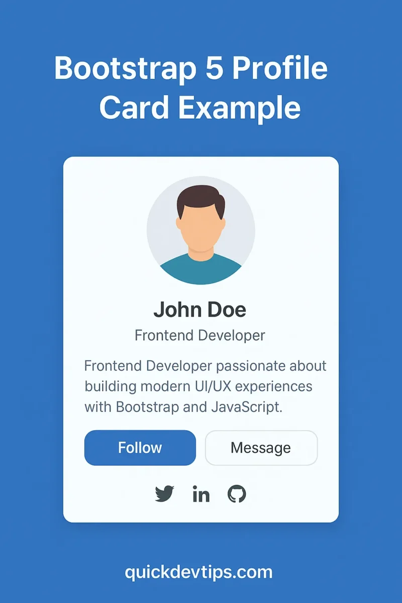
Bootstrap 5 Profile Card Example is a great way to display user information such as name, job title, bio, and social links. In this snippet, you’ll learn how to build a responsive profile card with image and buttons.
Bootstrap 5 Profile Card Example Code
<div class="container py-5">
  <div class="row justify-content-center">
    <div class="col-md-4">
      <div class="card text-center shadow">
        <img src="https://via.placeholder.com/400x300" class="card-img-top" alt="Profile Image">
        <div class="card-body">
          <h5 class="card-title">John Doe</h5>
          <p class="card-text">Frontend Developer passionate about building modern UI/UX experiences with Bootstrap and JavaScript.</p>
          <a href="#" class="btn btn-primary btn-sm me-2">Follow</a>
          <a href="#" class="btn btn-outline-secondary btn-sm">Message</a>
          <div class="mt-3">
            <a href="#" class="me-2 text-dark"><i class="bi bi-twitter"></i></a>
            <a href="#" class="me-2 text-dark"><i class="bi bi-linkedin"></i></a>
            <a href="#" class="text-dark"><i class="bi bi-github"></i></a>
          </div>
        </div>
      </div>
    </div>
  </div>
</div>
How It Works
This Bootstrap 5 Profile Card Example uses .card with a profile image, card body, and button actions. Social icons are included with Bootstrap Icons for quick integration.
Why Use This?
A profile card is useful for portfolios, team sections, and community pages. With Bootstrap, you get a responsive layout that adapts to any screen size.
Common Mistake
Using very large images without .card-img-top can break responsiveness. Always use properly sized images.
Pro Tip
Add .rounded-circle to the image class to make the avatar circular for a more modern design.