Bootstrap 5 Examples – Top 10 Snippets for Developers (Login, Navbar, Cards & More)
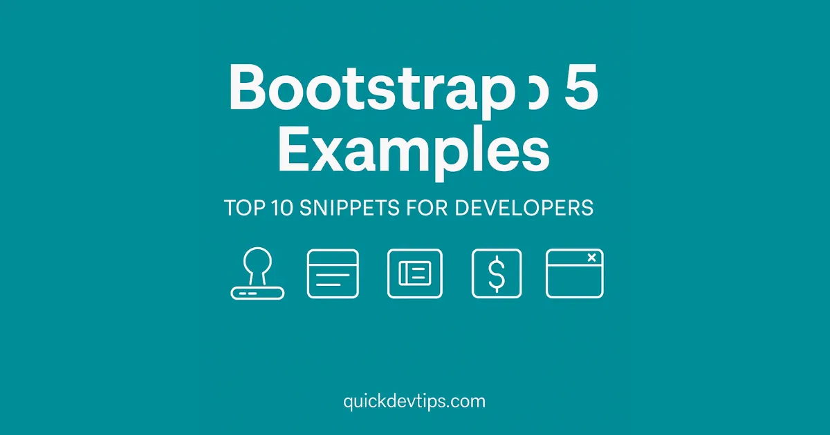
Introduction If you’re looking for ready-to-use Bootstrap 5 Examples, you’re in the right place. We’ve compiled our Top 10 snippets that every developer should have in their toolkit. From login forms to pricing tables, these examples are responsive, lightweight, and easy to integrate. Top 10 Bootstrap 5 Examples Bootstrap 5 Login Form Example Bootstrap 5 … Read more