Introduction
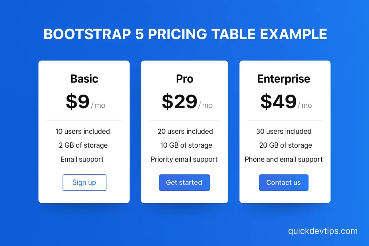
Bootstrap 5 Pricing Table Example is one of the most used components in SaaS websites, portfolios, and landing pages. In this snippet, you’ll learn how to build a responsive pricing section with Bootstrap cards.
Bootstrap 5 Pricing Table Example Code
<div class="container py-5">
  <div class="row text-center">
    <div class="col-md-4">
      <div class="card mb-4 shadow-sm">
        <div class="card-header">
          <h4 class="my-0 fw-normal">Basic</h4>
        </div>
        <div class="card-body">
          <h1 class="card-title pricing-card-title">$9 <small class="text-muted">/ mo</small></h1>
          <ul class="list-unstyled mt-3 mb-4">
            <li>10 users included</li>
            <li>2 GB of storage</li>
            <li>Email support</li>
          </ul>
          <button type="button" class="w-100 btn btn-lg btn-outline-primary">Sign up</button>
        </div>
      </div>
    </div>
    <div class="col-md-4">
      <div class="card mb-4 shadow-sm">
        <div class="card-header">
          <h4 class="my-0 fw-normal">Pro</h4>
        </div>
        <div class="card-body">
          <h1 class="card-title pricing-card-title">$29 <small class="text-muted">/ mo</small></h1>
          <ul class="list-unstyled mt-3 mb-4">
            <li>20 users included</li>
            <li>10 GB of storage</li>
            <li>Priority email support</li>
          </ul>
          <button type="button" class="w-100 btn btn-lg btn-primary">Get started</button>
        </div>
      </div>
    </div>
    <div class="col-md-4">
      <div class="card mb-4 shadow-sm">
        <div class="card-header">
          <h4 class="my-0 fw-normal">Enterprise</h4>
        </div>
        <div class="card-body">
          <h1 class="card-title pricing-card-title">$49 <small class="text-muted">/ mo</small></h1>
          <ul class="list-unstyled mt-3 mb-4">
            <li>30 users included</li>
            <li>20 GB of storage</li>
            <li>Phone and email support</li>
          </ul>
          <button type="button" class="w-100 btn btn-lg btn-primary">Contact us</button>
        </div>
      </div>
    </div>
  </div>
</div>
How It Works
This Bootstrap 5 Pricing Table Example uses .card components arranged in a responsive .row. Each card includes pricing, features, and a call-to-action button.
Why Use This?
A pricing table gives users a clear view of your service tiers. This example ensures mobile-friendly design and professional layout.
Common Mistake
Forgetting to make the cards responsive can cause overflow issues on smaller screens.
Pro Tip
Highlight the “Pro” or “Most Popular” plan with a different background color or button style to improve conversions.
1 thought on “Bootstrap 5 Pricing Table Example — Responsive Pricing Plans with Cards”