Introduction
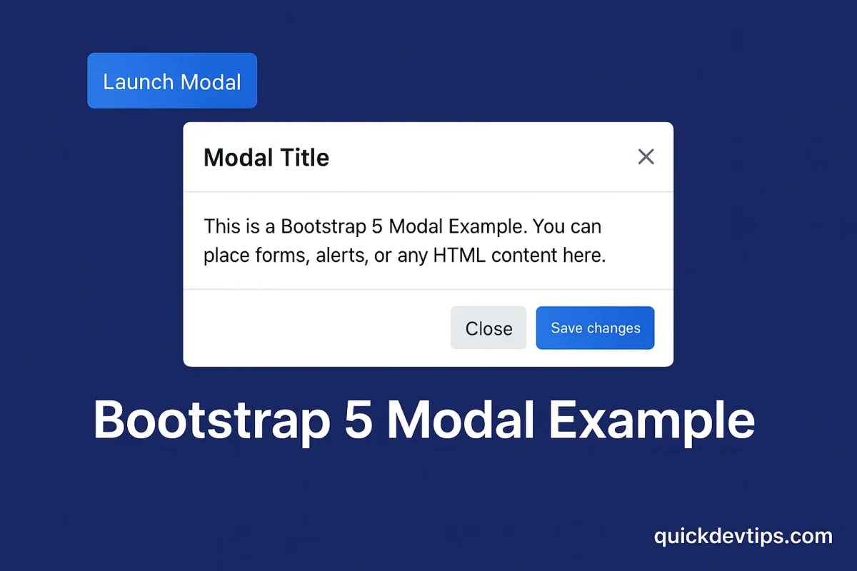
Bootstrap 5 Modal Example is a versatile component that allows you to display popups for login forms, alerts, or additional content. In this snippet, you’ll learn how to build a responsive modal with a close button and smooth animation.
Bootstrap 5 Modal Example Code
<!-- Button trigger modal -->
<button type="button" class="btn btn-primary" data-bs-toggle="modal" data-bs-target="#exampleModal">
  Launch Modal
</button>

<!-- Modal -->
<div class="modal fade" id="exampleModal" tabindex="-1" aria-labelledby="exampleModalLabel" aria-hidden="true">
  <div class="modal-dialog">
    <div class="modal-content">
      <div class="modal-header">
        <h5 class="modal-title" id="exampleModalLabel">Modal Title</h5>
        <button type="button" class="btn-close" data-bs-dismiss="modal" aria-label="Close"></button>
      </div>
      <div class="modal-body">
        This is a <strong>Bootstrap 5 Modal Example</strong>. You can place forms, alerts, or any HTML content here.
      </div>
      <div class="modal-footer">
        <button type="button" class="btn btn-secondary" data-bs-dismiss="modal">Close</button>
        <button type="button" class="btn btn-primary">Save changes</button>
      </div>
    </div>
  </div>
</div>
How It Works
This Bootstrap 5 Modal Example uses the modal component with fade for animation. The modal includes a header, body, and footer for flexible content.
Why Use This?
Modals are essential for displaying extra content without leaving the page. They’re perfect for login forms, popups, or confirmation dialogs.
Common Mistake
Forgetting the data-bs-toggle and data-bs-target attributes will prevent the button from triggering the modal.
Pro Tip
Use .modal-dialog-centered to vertically center your modal for better design.