Bootstrap Modal Basics — How to Create a Simple Modal with Bootstrap
Bootstrap Modal Basics help you add quick popups to your pages. Here’s how to create a simple modal with Bootstrap in just a few steps.
How to Create Bootstrap Modal Basics
</p>
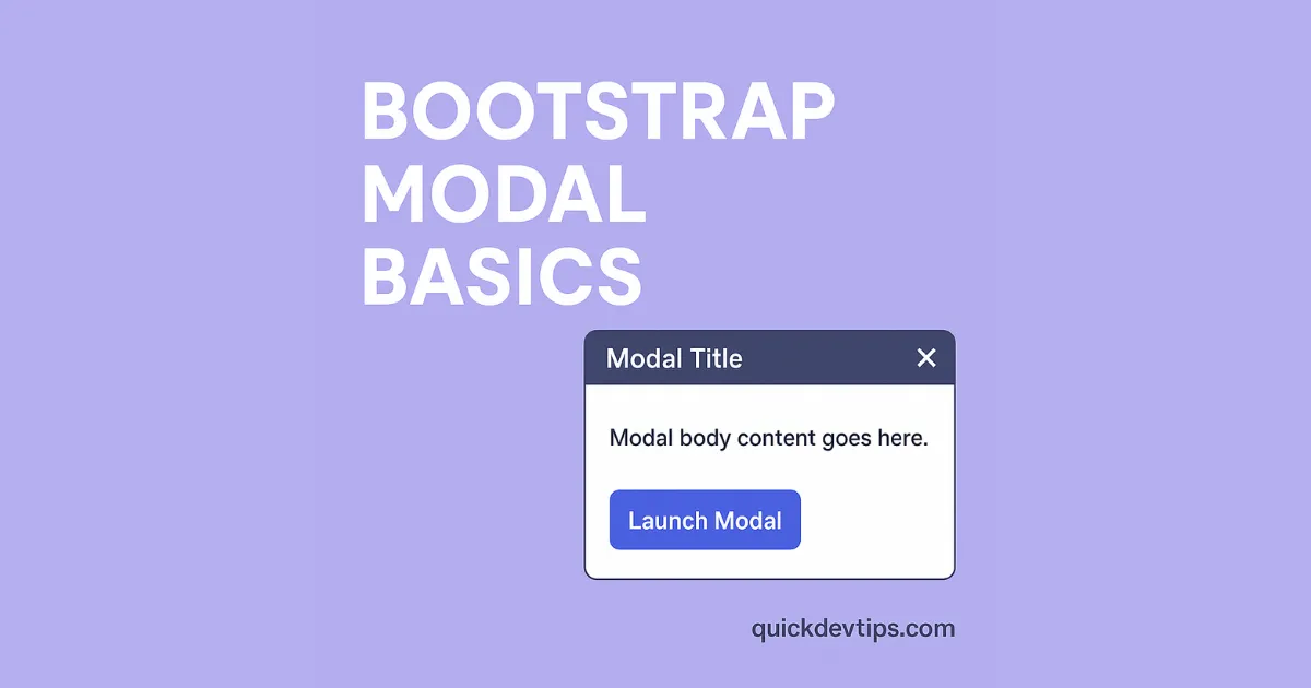
<!– Button trigger modal –> <button type=”button” class=”btn btn-primary” data-bs-toggle=”modal” data-bs-target=”#exampleModal”> Launch Modal </button> <!– Modal –> <div class=”modal fade” id=”exampleModal” tabindex=”-1″> <div class=”modal-dialog”> <div class=”modal-content”> <div class=”modal-header”> <h5 class=”modal-title”>Modal Title</h5> <button type=”button” class=”btn-close” data-bs-dismiss=”modal”></button> </div> <div class=”modal-body”> Modal body content goes here. </div> </div> </div> </div> How Bootstrap Modal Basics Work
A Bootstrap Modal Basics setup uses data-bs-toggle and data-bs-target to link a button to a modal.
Why Use Bootstrap Modal Basics
Use a Bootstrap Modal Basics popup to show extra information without leaving the page.
Common Mistake in Bootstrap Modal Basics
Forgetting the modal id or mismatching it with data-bs-target breaks the link between button and modal.
Pro Tip for Bootstrap Modal Basics
Use modal-dialog-centered to vertically center your modal on the screen.