Introduction
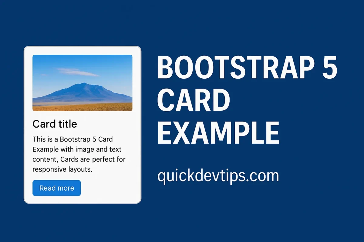
Bootstrap 5 Card Example is one of the most flexible components. Cards are used for displaying content blocks such as profiles, blog previews, or product listings. In this snippet, we’ll build a responsive card with image, text, and buttons.
Bootstrap 5 Card Example Code
<div class="container py-5">
<div class="row">
<div class="col-md-4">
<div class="card">

<img class="card-img-top" src="https://placehold.co/600x400" alt="..." />
<div class="card-body">
<h5 class="card-title">Card title</h5>
<p class="card-text">This is a Bootstrap 5 Card Example with image and text content. Cards are perfect for responsive layouts.</p>
<a class="btn btn-primary" href="#">Read more</a>

</div>
</div>
</div>
</div>
</div>
How It Works
This Bootstrap 5 Card Example uses .card, .card-img-top, and .card-body classes. You can easily extend it with buttons, links, or additional content sections.
Why Use This?
Cards are versatile and reusable. With Bootstrap 5 Card Example, you can design product cards, blog previews, or profile layouts quickly.
Common Mistake
Forgetting to wrap the image in .card-img-top can break responsive scaling and alignment.
Pro Tip
Use .h-100 on cards inside rows to ensure equal height layouts across columns.