Bootstrap Responsive Embed — How to Embed Videos Responsively with Bootstrap
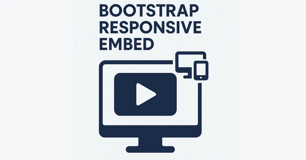
Bootstrap Responsive Embed makes it easy to add videos or iframes that scale perfectly on any screen. Here’s how to use Bootstrap’s ratio helper.
How to Use Bootstrap Responsive Embed
</p>
<div class=”ratio ratio-16×9″> <iframe src=”https://www.youtube.com/embed/example” title=”YouTube video” allowfullscreen></iframe> </div>
How Bootstrap Responsive Embed Works
The ratio class wraps your embed and maintains aspect ratio like 16:9 or 4:3.
Why Use Bootstrap Responsive Embed
Bootstrap Responsive Embed keeps your media elements looking good on all devices without manual CSS.
Common Mistake in Bootstrap Responsive Embed
Don’t forget to add allowfullscreen to iframes for proper full-screen support.
Pro Tip for Bootstrap Responsive Embed
Use ratio-1x1 or ratio-4x3 to switch aspect ratios easily.
1 thought on “Bootstrap Responsive Embed”