Bootstrap Card Shadow
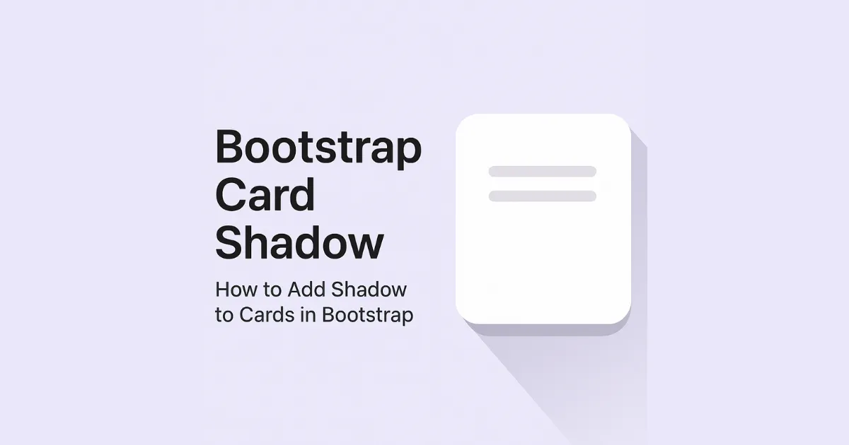
Bootstrap Card Shadow — How to Add Shadow to Cards in Bootstrap Bootstrap Card Shadow makes your cards stand out with depth and style. Here’s how to add a shadow to any Bootstrap card. How to Add Bootstrap Card Shadow How Bootstrap Card Shadow Works The shadow class applies a default box-shadow. Use shadow-sm or … Read more